About this website
This website is a TOT project within itself, one where my expertise came in handy. Designing and building websites is not my forte, whereas envisioning them and writing the functional specifications is. Plus, I simply enjoy writing.

Janneke ten Cate at Jips Company, who also took care of the house style and previous site, came up with the graphic design, elaborated on my interaction design and managed the build.
Technical production
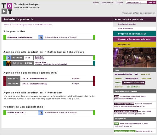
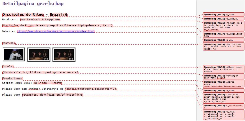
For years I have used a self-built database for technical production, where I save all the play data, contact and technical details of all productions. Production schedules and technical riders are reports issued from the database. I wanted to do something with the data on the TOT website and wanted an online production archive, including texts, imagery and interactive content. Jan Verhoek at Javinto developed the idea with me. I enriched the database with fields for texts, hyperlinks, Twitter search terms and codes from YouTube playlists as well as Picasa web albums, and Jan built a web application for my functional design. An XML export from my own database feeds the Calendar, the Production Overview and the pages with performance details, companies and theatres. Sabine Visser programmed the integration of Jan’s artwork in WordPress. You can see the result under Technical Production.
WordPress
An open source CMS, specifically WordPress, was my preferred choice. WordPress is a much used CMS, also by TOT clients, and I was impressed with its many options. However, “standard” is not what Jan and I had in mind. Marieke van de Pol devised a theme and a combination of plug-ins and widgets that made the realisation of my functional design and Janneke’s graphic design, possible. Rolf Kleef advised on how to integrate social media.
Responsive
In the course of 2014 mobile use of the TOT site suddenly increased. We made a plan to turn the existing design into a site that is partly adaptive and partly responsive. During tests I noticed that the mobile user not only needs bigger buttons and different font sizes, but consumes the content of the site in an entirely different way. Reason enough to shift things around: no longer start with the history and background, but core information first. The background is of secondary interest.
Texts
I have written all the text, except where specifically given in the form of a quote. The editorial contribution by Carola Janssen and Maria Neele at Kiezel Communicatie was invaluable in this part of the process. The same is true for the translation of the English texts by Virtual Words.
Images
On the home page I wanted to use strong images. Images that had something to tell about the content of the site without illustrating it. Images that fit together. I chose the work of Niko van der Klugt and am very happy to have his pictures on my website. Janneke chose the fragments and made sure they fit in with her design. The ICT bicycles made me laugh, because there is of course a sophisticated web application behind them.
Social media
As social media play such a huge role in my life and work, I also wanted to show on the site what is available online. Janneke suggested that, in addition to sections about technical production, ICT Project management and the Uurwerk staff scheduler, we build a section titled Inspiration. This section was to include, among other things, everything that I collate and share on the web, a part of which you are currently reading. I hope it inspires you.
